


Masterchef is a food service brand belonging to Recheio, a Portuguese wholesaler offering bulk and oversized solutions for professional Chefs and Horeca owners.
The brand's identity on package was outdated and not really speaking with the target audience. It need to become more professional, increase credibility and transmit
the real quality of the products.
The challenge was to redesign the packaging architecture and to define an up-to-date identity, adapted to the demands of today's market. As the brand exists in the market
for several decades and its easily identifiable on shelf, one of the challenges was
make an evolution of the previous identity, but now more evolved and better
fitting the needs of professionals.
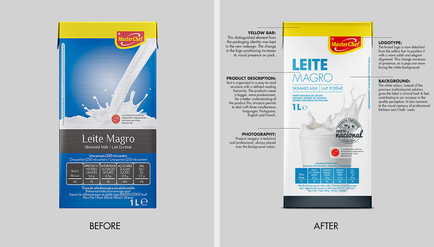
The solution evolves elements from the previous packaging and creates a new contemporary look & feel. The result is clean, enhancing the presence of the logotype, now bigger and less integrated in the yellow bar. A less colored packaging, kept sober, now entirely white, as Chefs jackets usually are. All very clinical, breathing efficiency.
The product name is integrated in a well defined hierarchical structure,
to permit three languages on pack. Easy to read and direct to the point.
Overall transmitting technicality, quality and expertise.
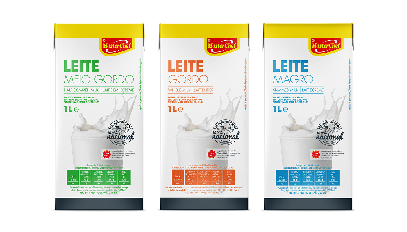

The Masterchef rebranding provides the brand with a two-tier branding solution.
A common package design architecture that changes its background color and photography style when changing between mainstream products and premium quality.


Photography is essential in the package structure. It permits to be transparent
regarding the product's characteristics and helps professionals choose.
For mainstream products, it focus on technical and raw product images, showcasing the product and its functionality as it is. In the premium tier, products' photography features
a crafted environment over a dark gradient background.
Imagery is overall simple, with minimal production, emphasising the product or its characteristics. It prioritises appetite appeal, with an aesthetic focus on simplicity. Makes the photography the main element whenever possible, giving it maximum prominence.


